The 2025 Standard
User expectations have evolved. What impressed visitors five years ago now feels dated. Sites need to be fast, accessible, responsive, and visually sophisticated. Here's what matters now and how to deliver it.
1. Speed is Non-Negotiable
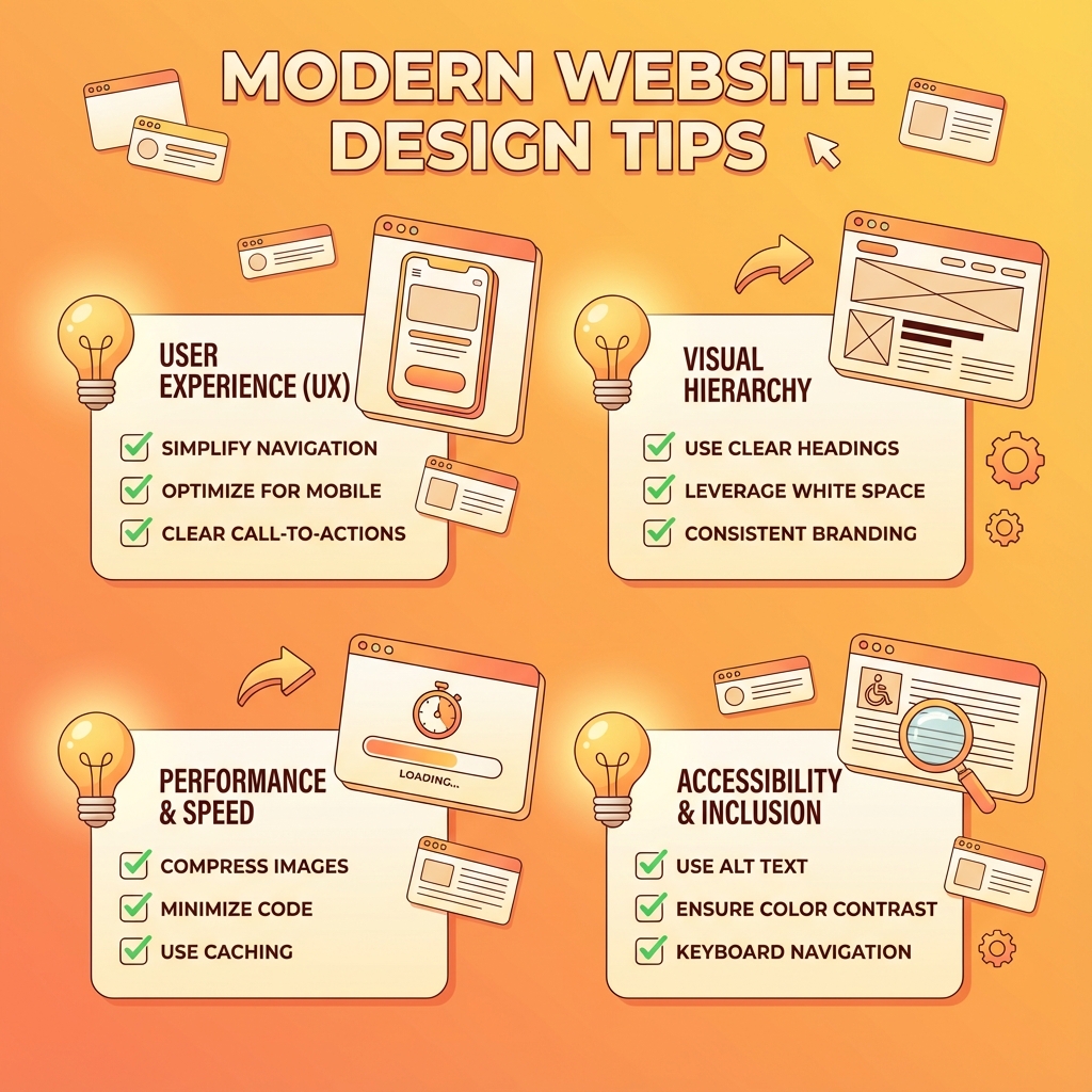
Google's Core Web Vitals now directly affect search rankings. The key metric is LCP (Largest Contentful Paint)—how long it takes for the main content to appear. If your LCP is over 2.5 seconds, Google penalizes you in search results. Users also bounce—studies consistently show abandonment rates climb sharply as load times increase.
What matters:
- Use modern image formats like AVIF and WebP, which are dramatically smaller than JPEG at equivalent quality
- Leverage edge caching so content loads from servers near your users, not from a single origin
- Minimize JavaScript bundles—every kilobyte takes time to download and parse
- Lazy load content below the fold so the visible page loads first
BYOB handles most of this automatically, but understanding why it matters helps you make better decisions.
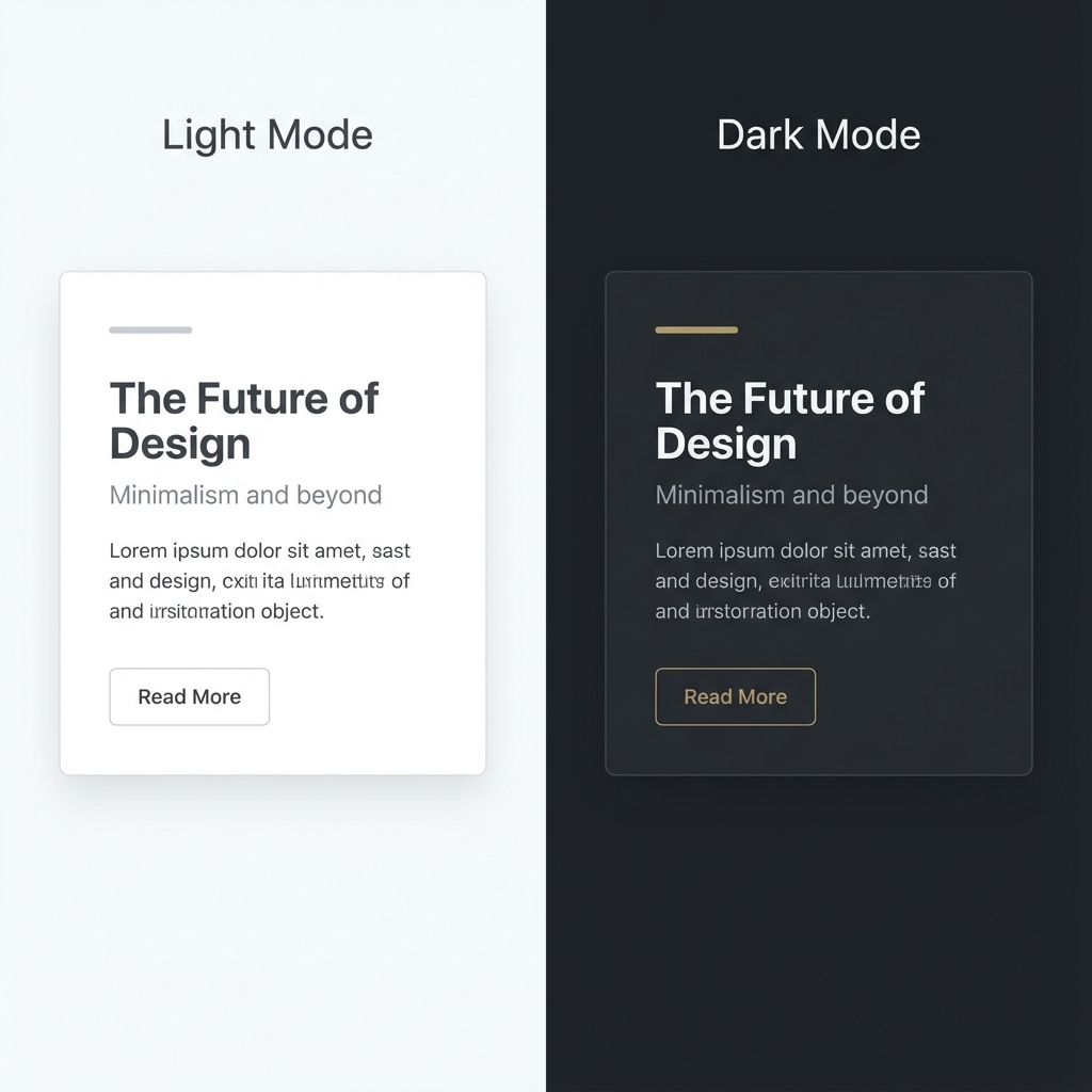
2. Dark Mode is Expected
Operating systems default to dark mode more often than not. Users who enable dark mode at the system level expect websites to respect that preference. A bright white website at 11 PM makes users squint, reach for their screen brightness, or simply leave.
Implementation:
Use the prefers-color-scheme CSS media query to detect system preferences and swap color schemes automatically. Design your color palette with both modes in mind from the start—retrofitting dark mode is harder than planning for it initially.
3. Micro-Interactions Communicate Quality
Static pages feel lifeless. Small, thoughtful animations signal quality and attention to detail. Buttons that respond to clicks, cards that lift on hover, icons that rotate when processing—these details make interfaces feel responsive and polished.
Best practices:
- Keep animations subtle and fast (200-300ms for most transitions)
- Use
transition: all 0.2s easeon interactive elements - Animate only what's necessary—motion should guide attention, not distract
- Respect reduced-motion preferences for users who find animation disorienting
The goal isn't flashy animation. It's interfaces that feel alive and responsive to user actions.
4. Mobile is the Default, Not the Override
More than half of web traffic comes from mobile devices. For many categories—local businesses, restaurants, social media links—mobile traffic dominates even more. Yet many sites are still designed desktop-first and then awkwardly adapted for smaller screens.
The inversion:
Write mobile layouts first. Use media queries like @media (min-width: 768px) to add complexity for larger screens, not to remove complexity for smaller ones. This mindset produces naturally simpler, more focused designs that work everywhere.
Test on actual phones, not just browser dev tools. The experience of using a site with your thumb is different from clicking with a mouse.
5. Accessibility is ROI, Not Compliance
Approximately 15% of the global population—nearly 1 billion people—has some form of disability. That's not a niche demographic to accommodate; it's a significant portion of your potential audience.
But accessibility isn't just about disability. Good accessibility practices improve usability for everyone. Clear contrast helps in bright sunlight. Keyboard navigation helps power users. Proper heading structure helps screen readers and search engines alike.
Quick test:
Navigate your entire site using only the Tab key. Can you access everything? Does focus move in a logical order? If you get stuck or can't see where focus is, your site has accessibility problems that affect real users.
6. Storytelling Converts Better Than Features
People don't buy products. They buy better versions of themselves. They buy solutions to their problems.
A feature list ("real-time sync, infinite storage, cross-platform") doesn't connect emotionally. A story that follows the problem-agitation-solution pattern does.
Problem: "Tired of losing track of important files across different devices?"
Agitation: "Every minute spent searching for that document is a minute you can't bill. It adds up to hours every week."
Solution: "Our app syncs everything automatically. Whatever you save, wherever you save it, is instantly available everywhere."
Outcome: "Never search for a file again. Focus on work that matters."
7. Semantic HTML for Machines and Humans
Google's AI increasingly understands page structure, not just keywords. Using proper HTML5 semantic tags (<article>, <nav>, <aside>, <header>, <footer>, <main>) tells search engines what different parts of your page mean.
This matters beyond SEO. Screen readers use semantic structure to help users navigate. Browsers can offer better reading modes. Future AI systems will parse your content more accurately.
Stop using div soup. Replace <div class="navigation"> with <nav>. Replace <div class="article"> with <article>. The code is cleaner, and machines understand it better.
8. Authenticity Wins Attention
The web is flooded with generic stock photography and AI-generated content. Every SaaS landing page has the same illustration style. Every corporate website has the same handshake photos.
Standing out requires authenticity. Real photos of your actual team. Genuine customer testimonials with real names. Writing that sounds like a human with opinions, not a committee avoiding controversy.
Practical steps:
Take real photos. Record actual screen captures. Write in first person. Have opinions. The specificity and realness is what makes content memorable.
9. Fewer Form Fields, Higher Conversion
There's consistent research showing that every additional form field reduces conversion rates by roughly 10%. Each field is friction—something the user has to think about, decide on, and type.
For lead capture:
Ask for email only. You can get more information later in a follow-up sequence or during onboarding. The goal at initial capture is to start the relationship, not to collect a complete profile.
For checkout:
Require only what's necessary to process the transaction. Offer guest checkout—forced account creation loses sales. If you need a phone number, explain why ("for delivery updates only").
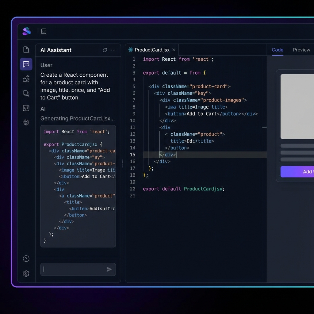
10. Use AI Tools to Work Faster
Writing every line of code by hand in 2025 is like writing every memo by hand when you have a word processor. Tools exist that handle boilerplate, generate components, and accelerate the mechanical parts of building.
This doesn't mean outsourcing your judgment. It means automating the parts that don't require judgment so you can focus on the parts that do: creative direction, user experience, strategic decisions.
BYOB handles the code generation and deployment complexity. Your job is deciding what to build and refining until it's right. The leverage is enormous.
Build for 2025
The web keeps evolving. User expectations keep rising. The sites that succeed are the ones that meet those expectations: fast, accessible, mobile-native, visually sophisticated, and built with the best available tools.